Thinking inside the Box:
A complete EQ and Compression tutorial
Part Three: EQ: Thinking Visually
The splodge
The simplest way of explaining frequency is that it is the technical term for pitch. The "A" above middle C (or is it below, I can never remember), for example, is 440hz. However, the first key point to establish is that sounds, in practical terms, do not have 'a' frequency, they span a whole range of frequencies. Any instrument will produce not just 440hz but a wide range of frequencies at various different volumes, with our overall impression of their 'sound' reflecting this complex output. How do we tell the difference between a violin playing an A and a trumpet playing an A? By their 'timbre', or the overall quality and properties of the sound. Mathematically, this equates to the overall 'shape' of the frequencies produced. Not making any sense? Check these diagrams.
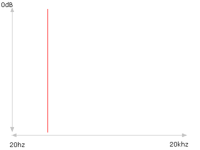
Sine Wave (A)
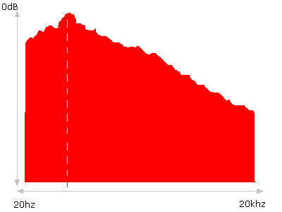
Piano (A)
(Again, I should point out that my diagrams do not purport to be accurate, although they are loosely based on actual spectral analysis.)
An array of splodges
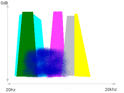
Time now to reveal a great secret, a killer killer tip which will revolutionise how you produce and make you successful overnight. Dream on! There is no such thing. On the other hand, this idea works for me, and it may just be some help to you. Here goes: when producing, and especially when mixing, constantly visualise the elements of your track as various different coloured splodges on the same graph. Remember - all your sounds are fitting in the same box. You only have one frequency spectrum to fill (or otherwise) with noises. Remembering that I have already apologised for my abysmally lazy graphic design disasters, lets take a look at what a hypothetical drumnbass track might look like in this kind of visualisation - in this case, a simple but well-produced effort:
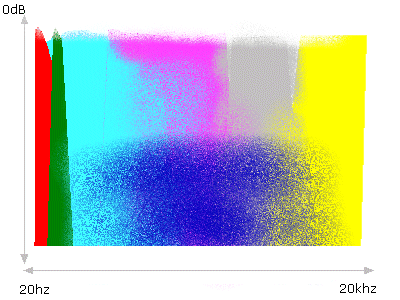

- There are no subs (the track will feel bass-light, not heavy, 'deep' or 'warm' enough).
- The bassline is too thin. It does not extend far enough to the right - meaning it lacks power in the treble regions. This will equate to a lack of 'presence' or 'bite'.
- The kick is too wide, and overpowers the bassline by sitting in practically the same place.
- The pad extends too far left, interfering with the kick drum (this will equate to muddiness).
- There is a 'hole' between the lower elements and the mid/upper elements (in this case, shown between the bassline and snare). Such holes will sound pretty much exactly that - a hole or gap in your track. Your mix will feel incomplete, and lack power and fatness.
- The snare is too thin. It contains only mid/upper-mid/treble frequencies, and no lower-mid freqencies at all. This will equate to a weak, 'tinny' snare.
- The synths are also too thin, leaving another small hole in the response.
- The hats and cymbals tail off too early, leaving a lack of anything at the very far right of the spectrum. This will equate to a lack of 'sparkle' or 'air' in your track, or in extreme cases, a mix that sounds flat and dull, like it is coming from under a pillow.